Let the branding wars begin
December 8, 2012 12:41 PM Subscribe
The University of California recently released its design for a new logo, and has launched an extensive visual rebranding campaign around it. Though the aim of the new logo is to convey a spirit of modern innovation, detractors feel it lacks the gravitas of the old seal, likening the new logo to a Swedish cake roll, and have started a petition to halt the change to the University's visual identity.
Blue tongue, yellow swirl.
Windowlicker.
posted by Sys Rq at 12:45 PM on December 8, 2012 [6 favorites]
Windowlicker.
posted by Sys Rq at 12:45 PM on December 8, 2012 [6 favorites]
That is by far and away THE UGLIEST DAMN THING any school could ever put on their materials.
It reminds me of nothing else other than a day-glo tulip trying to digest a tapeworm, or possibly a wet Cheeto.
Have fun ever getting money from your donors again in this century, Development Department.
posted by Lipstick Thespian at 12:45 PM on December 8, 2012 [10 favorites]
It reminds me of nothing else other than a day-glo tulip trying to digest a tapeworm, or possibly a wet Cheeto.
Have fun ever getting money from your donors again in this century, Development Department.
posted by Lipstick Thespian at 12:45 PM on December 8, 2012 [10 favorites]
Thats... terrible. And very Web 2.0. Aren't we on Web 3.0 now anyway? They'll just have to redo it for touchscreen and Windows 8.0 in a year or two.
posted by Justinian at 12:46 PM on December 8, 2012
posted by Justinian at 12:46 PM on December 8, 2012
I'm confused by the uproar this is causing, the several colleges I've attended and worked for each maintain a "seal" and a "logo" as separate designs with different purposes (with explicit usages spelled out by "college relations" or "public information" or whoever controls that sort of thing).
posted by trackofalljades at 12:46 PM on December 8, 2012 [4 favorites]
posted by trackofalljades at 12:46 PM on December 8, 2012 [4 favorites]
I like that logo more when I picture it animated in the style of a 1970s public-television bumper.
posted by mykescipark at 12:46 PM on December 8, 2012 [20 favorites]
posted by mykescipark at 12:46 PM on December 8, 2012 [20 favorites]
As one of the many, many, many UC system alums out there, let me say this: seriously, UCOP? stop fucking around with logos (like the student in the first article says: 'Harvard's not going around changing its seal') and start fucking around with the huge systemic issues like year to year budgeting shortfalls and under-prepared students.
posted by librarylis at 12:47 PM on December 8, 2012 [28 favorites]
posted by librarylis at 12:47 PM on December 8, 2012 [28 favorites]
I clicked on the link snarking in my head about how any logo change is going to have people bitching about it, and seconds later I clicked away, horrified.
Seriously, UC. No no no no no no no no no.
posted by Navelgazer at 12:49 PM on December 8, 2012 [13 favorites]
Seriously, UC. No no no no no no no no no.
posted by Navelgazer at 12:49 PM on December 8, 2012 [13 favorites]
As I come from a school with a slightly different shade of yellow and blue, this frightens me. It's enough that they plaster the block M whenever and wherever, and if they shifted to such a style, I may just end up regretting graduating from the place (of course, I kid, but I would feel a bit odd).
posted by JoeXIII007 at 12:50 PM on December 8, 2012 [1 favorite]
posted by JoeXIII007 at 12:50 PM on December 8, 2012 [1 favorite]
it's like that little spinning circle firefox uses to tell you that it is going to take a long time to load the page you wanted to have a quick look at.
posted by 5_13_23_42_69_666 at 12:50 PM on December 8, 2012 [16 favorites]
posted by 5_13_23_42_69_666 at 12:50 PM on December 8, 2012 [16 favorites]
Give it some time people.
Call me if a "+" appears.
posted by hal9k at 12:51 PM on December 8, 2012 [1 favorite]
Call me if a "+" appears.
posted by hal9k at 12:51 PM on December 8, 2012 [1 favorite]
No, Bears!
posted by It's Never Lurgi at 12:52 PM on December 8, 2012 [1 favorite]
posted by It's Never Lurgi at 12:52 PM on December 8, 2012 [1 favorite]
They have taken the obnoxious, and by now dated, branding trend of lowercase letters to its extreme by fading the letter. I guess you're supposed to think that University of California is humble, edgy or indie.
posted by Foci for Analysis at 12:54 PM on December 8, 2012 [1 favorite]
posted by Foci for Analysis at 12:54 PM on December 8, 2012 [1 favorite]
I'm confused by the uproar this is causing, the several colleges I've attended and worked for each maintain a "seal" and a "logo" as separate designs with different purposes (with explicit usages spelled out by "college relations" or "public information" or whoever controls that sort of thing).
This is a good point - I don't know that the UC system really had a logo other than the seal for things that aren't super official. Even Harvard has a simplified 'shield H' logo instead of their veritas thing. My school, UVa, has a similar old-school looking seal for the official stuff, but they use the V and crossed sabers of the athletic department for a lot of other purposes, and even that was somewhat recently redesigned from just a big orange V. So I think there is a point to the whole system having a more "logo" kind of thing instead of just a seal.
But yeah, this logo isn't very good and looks like it'll seem dated very quickly (it looks dated to me already). I almost expect Apple to sue them over stealing their IP for iPod operation or something.
posted by LionIndex at 12:56 PM on December 8, 2012
Hipstaversity.
posted by CheeseDigestsAll at 12:56 PM on December 8, 2012
posted by CheeseDigestsAll at 12:56 PM on December 8, 2012
That is by far and away THE UGLIEST DAMN THING any school could ever put on their materials.
A logo with Geddy Lee and Ronnie James Dio holding aloft the torch of knowledge would be uglier.
posted by ROU_Xenophobe at 12:56 PM on December 8, 2012 [8 favorites]
A logo with Geddy Lee and Ronnie James Dio holding aloft the torch of knowledge would be uglier.
posted by ROU_Xenophobe at 12:56 PM on December 8, 2012 [8 favorites]
Awful. And wasn't the cursive Cal the logo, like the block M or the Harvard shield?
posted by Existential Dread at 12:57 PM on December 8, 2012
posted by Existential Dread at 12:57 PM on December 8, 2012
And wasn't the cursive Cal the logo, like the block M or the Harvard shield?
Only for Berkeley. There's a bunch of schools in the system.
posted by LionIndex at 12:58 PM on December 8, 2012 [1 favorite]
Only for Berkeley. There's a bunch of schools in the system.
posted by LionIndex at 12:58 PM on December 8, 2012 [1 favorite]
Oh, sure. But they each have a logo, like UCSD or UC Davis.
posted by Existential Dread at 1:01 PM on December 8, 2012
posted by Existential Dread at 1:01 PM on December 8, 2012
UC employee here. Do not like.
However, here's a fun fact for you. I organized and staffed a large graduation ceremony this past year, and the Chancellor was present. (She goes to a different school's ceremony every year. This was our year.) When the Chancellor speaks, the official seal of the university is affixed to the podium. But the thing is, THE OFFICIAL SEAL of the university is affixed to the podium -- there is only one. It's not a seal, it's THE seal. Someone on campus has the job of procuring THE seal from where it's housed in lower Freeborn Hall (I tried to get clarification on where it was kept -- in a closet? in someone's desk? in a special case?) and transport it to the event. We had some very scary moments immediately prior to the beginning of the commencement ceremony because the seal hadn't arrived yet, and we knew the Chancellor was going to be PISSED if it wasn't there.
She's going to look even sillier in front of that new hood-ornament-looking thing.
posted by mudpuppie at 1:01 PM on December 8, 2012 [10 favorites]
I hate it so much.
(Almost as much as I hate having Arnold Schwarzenegger's signature on my diploma.)
posted by iamkimiam at 1:03 PM on December 8, 2012 [9 favorites]
(Almost as much as I hate having Arnold Schwarzenegger's signature on my diploma.)
posted by iamkimiam at 1:03 PM on December 8, 2012 [9 favorites]
This was on Brand New recently. The first link is very misleading because the seal and the UC logo pictured are both part of the redesign.
posted by stopgap at 1:05 PM on December 8, 2012 [2 favorites]
posted by stopgap at 1:05 PM on December 8, 2012 [2 favorites]
(Although I see there is now a correction that maybe the seal had already been redone. In any case, the correct comparison for how this fits into the UC visual system is at the top of the Brand New write-up.)
posted by stopgap at 1:13 PM on December 8, 2012
posted by stopgap at 1:13 PM on December 8, 2012
this is all I have to say on the matter
posted by phaedon at 1:22 PM on December 8, 2012 [2 favorites]
posted by phaedon at 1:22 PM on December 8, 2012 [2 favorites]
From the Brand New link: there is also a revised seal [nb: actually from a previous revision, not this rebranding] that maintains the overall wobbliness of the original but with cleaned up details like less text on the book
Okay then. There's a metaphor for you.
posted by hattifattener at 1:25 PM on December 8, 2012 [9 favorites]
Okay then. There's a metaphor for you.
posted by hattifattener at 1:25 PM on December 8, 2012 [9 favorites]
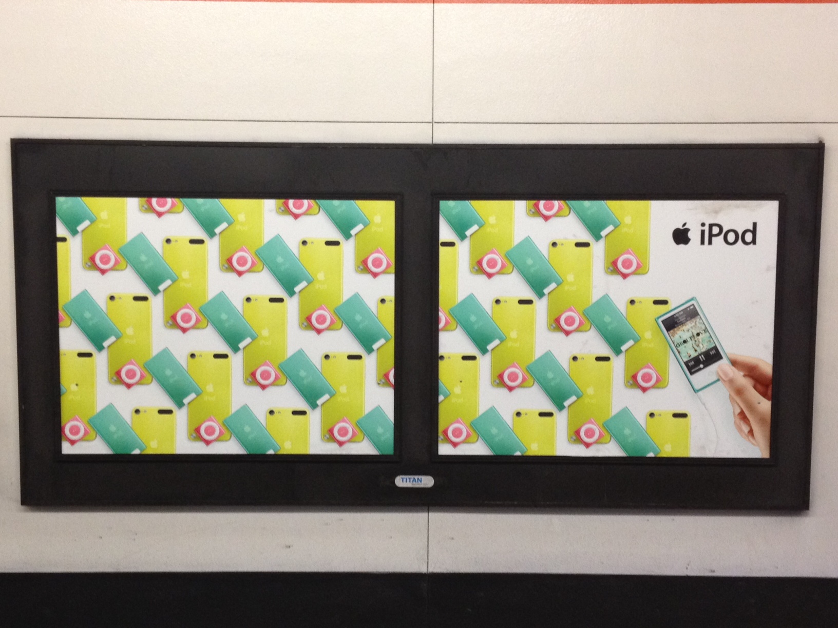
I love all the supporting materials around the logo, such as the colored patterns and livery and things (similar to Apple’s new iPod campaign), but the mark itself is super bleh, a blehness reinforced by the milquetoast artisinal Brooklyn 2009 douchenozzle video they’ve used to introduce it. I say this as someone who expressed immediate, unreserved appreciation for the the London 2012 identity as soon as it was released in spite of the buckets of public haterade.
posted by migurski at 1:27 PM on December 8, 2012 [1 favorite]
posted by migurski at 1:27 PM on December 8, 2012 [1 favorite]
I think it looks like a yellow cat disappearing into a large blue tulip. That makes me happy, for some reason. Of course, it's not my school or my logo.....
posted by GenjiandProust at 1:29 PM on December 8, 2012
posted by GenjiandProust at 1:29 PM on December 8, 2012
It's ugly, it's non-intuitive (that's a "U"?), and the blue and yellow clash with all the other blues and yellows of all the different universities (yes, they all have different color branding).
posted by oneirodynia at 1:29 PM on December 8, 2012 [1 favorite]
posted by oneirodynia at 1:29 PM on December 8, 2012 [1 favorite]
Wow. Just...wow. That's one terrible logo. Have fun reproducing that in a format that doesn't allow continuous tone blending.
posted by Thorzdad at 1:31 PM on December 8, 2012 [1 favorite]
posted by Thorzdad at 1:31 PM on December 8, 2012 [1 favorite]
Have fun reproducing that in a format that doesn't allow continuous tone blending.
The one-color version is at the Brand New article linked above. It actually looks like the main application with the wordmark is the one-color version, which is clearer in general.
posted by stopgap at 1:36 PM on December 8, 2012
The one-color version is at the Brand New article linked above. It actually looks like the main application with the wordmark is the one-color version, which is clearer in general.
posted by stopgap at 1:36 PM on December 8, 2012
Universities should not have logos, as businesses should not have seals. But if a university system must have a logo, it should not be as ugly, banal, and symbologically irrelevant to the mission of the university as this one is. As a UC alumni, I can say without exaggeration that I'm deeply saddened, broken-hearted quite honestly, at how far the system is falling so quickly.
posted by clockzero at 1:36 PM on December 8, 2012 [2 favorites]
posted by clockzero at 1:36 PM on December 8, 2012 [2 favorites]
I just like looking at the picture of the cake.
posted by elizardbits at 1:37 PM on December 8, 2012 [5 favorites]
posted by elizardbits at 1:37 PM on December 8, 2012 [5 favorites]
It's quite festive.
posted by elizardbits at 1:37 PM on December 8, 2012
posted by elizardbits at 1:37 PM on December 8, 2012
Maybe it's just me, but the first thing that came to mind when I saw that logo was:
Penis.
Yellow, curvy, penis.
I probably just need to get laid. Soon.
posted by freakazoid at 1:42 PM on December 8, 2012
Penis.
Yellow, curvy, penis.
I probably just need to get laid. Soon.
posted by freakazoid at 1:42 PM on December 8, 2012
Can one of our resident graphic designers explain why companies with historically-recognizable, even "distinguished" logos, feel the need to completely screw that up for no apparent reason?
I understand that in an existential crisis, rebranding can help an organization escape its past and survive. It gets across "we don't do that anymore".
But when something like UC decides on a whim to replace a dignified classic with - Well, I pretty much thought the same as Bwithh, it looks like piss circling the bowl of a stylistic toilet* - Why the hell would any orgnization do that to themselves?
Ah well, they'll just end up quietly un-doing it in another six months, once sanity sets in - Just like every other organization that decides to replace gravitas with pop cultural bullshit in a sad attempt to look "cool".
* Emblematic of your chances of getting a job after dropping over $200k on that humanities degree?
posted by pla at 1:44 PM on December 8, 2012 [1 favorite]
I understand that in an existential crisis, rebranding can help an organization escape its past and survive. It gets across "we don't do that anymore".
But when something like UC decides on a whim to replace a dignified classic with - Well, I pretty much thought the same as Bwithh, it looks like piss circling the bowl of a stylistic toilet
Ah well, they'll just end up quietly un-doing it in another six months, once sanity sets in - Just like every other organization that decides to replace gravitas with pop cultural bullshit in a sad attempt to look "cool".
* Emblematic of your chances of getting a job after dropping over $200k on that humanities degree?
posted by pla at 1:44 PM on December 8, 2012 [1 favorite]
It's perfect. It shows how the concept of the University is fading from viability. For what was a University, in the beginning? It was a building housing a number of books. Books which are completely outmoded now. And lecture halls? Why, exactly? The University is everywhere and nowhere now. The idea that there is a collection of buildings in a particular spot where learning will take place is ancient history.
posted by telstar at 2:00 PM on December 8, 2012
posted by telstar at 2:00 PM on December 8, 2012
Pla, I imagine that the corporatization of the UC’s identity is not unrelated to the way that campuses and physical locations are becoming less important to the transnational universities of the future. UC Berkeley is working on a satellite campus in Shanghai’s Zhangjiang Hi-Tech Park, for example. Aaron Bady and Gina Patnaik tie it in to the inconvenient spatial politics that happen on campus in an essay from earlier this year:
posted by migurski at 2:10 PM on December 8, 2012 [5 favorites]
As a closer look at the events around the November 9th strike reveal, moreover, the connection between the force meted out on student bodies on campus and long-developed plans to chart new directions for the university — in China and as an online university — are not simply conceptually related. The Chancellor’s physical absence from campus on Nov. 9th and the way his place was quite literally taken by the physical violence of the police speaks to the very concret retreat from actual university space, what they call the “bricks and mortar” campus, that gives “privatization” a tangible form.Chancellor Birgenau was not present for last year’s on-campus protests, because he was in Shanghai. More from Bady/Patnaik:
Sather Gate has morphed into a pseudo-proscenium, a background for photo-ops with potential investors, representing no more than the symbolic capital which Berkeley has become: less a place than a certificate. This “arch” opens onto nothing: it frames a projection screen, allowing external images to bounce back endlessly. I wish that I had more information to share or post about UC-Berkeley-Zhangjiang Tech Park.Space and matter are some of the few things that your typical 19 year old, first in her family to attend college, can conceivably influence. The University’s disappearance into air severs that influence. There’s probably something someone smarter than me could infer about the digital university of the future and loosely-joined terrorist cell organizations.
posted by migurski at 2:10 PM on December 8, 2012 [5 favorites]
More like the wall mural in a Swedish elementary school gym. They should just make their new logo the Let the Right One In girl.
posted by Beardman at 2:12 PM on December 8, 2012
posted by Beardman at 2:12 PM on December 8, 2012
Penis.
Heh. Yep. It's not quite anatomically correct as-is, but all the elements are there for a very quick photoshop into nsfw-ville.
posted by Sys Rq at 2:16 PM on December 8, 2012
Heh. Yep. It's not quite anatomically correct as-is, but all the elements are there for a very quick photoshop into nsfw-ville.
posted by Sys Rq at 2:16 PM on December 8, 2012
Should be perfect for UC Santa Cruz since it looks like a banana slug.
posted by 445supermag at 2:25 PM on December 8, 2012 [2 favorites]
posted by 445supermag at 2:25 PM on December 8, 2012 [2 favorites]
Ugh, this is depressing, both as a UC alum and as someone whose current university is undergoing some kind of "identity initiative" at the behest of our upper administration.* I do think things like this are the correlated with corporatization of higher ed, resulting in a shift of funding priorities towards things like branding, bonuses/salary for upper administration, etc. Another factor is that many higher ed admin jobs at the dean-and-up levels these days are viewed as stepping stones to even fancier jobs, another "innovation" from industry. This leads to a need for administrators to put their personal stamp on things in a relatively short time, have named initiatives they can point to, etc.
* There is a semi-fancy (for academia) web 2.0 page about the initiative soliciting feedback from employees/alums etc in the form of 30 second elevator pitches (with even some kind of javascript timer running). The main content of the page says something to the effect of, "Our identity is confused, this needs fixing. You may have heard of previous rebranding efforts that have failed, but this time it will be different, we promise! We created a committee!" I'm seriously not kidding.
posted by advil at 2:28 PM on December 8, 2012 [2 favorites]
In my experience there is nothing university administration loves as much as a rebranding exercise. For one, it allows them to send out missives to departments about using the wrong letterhead, having the wrong sort of bar across the top of their web pages, and other sorts of failures that are entirely their fault for not getting on the corporate bandwagon and understanding just how important this new hideous logo/lettering/sequence of meaningless symbols are. Last time my university changed the way web pages were supposed to look they didn't actually tell us for months, but they did send someone to pityingly shake their head at us in a department meeting for not knowing about the change. I honestly thought the poor person responsible for our web page was going to leap across the table and strangle the head shaker.
The problem with this one is that it already looks outmoded as well as being ugly. And I cannot imagine anyone,except for people who designed it, wanting buy anything with it on it. Unless they set fire to all the other branded items they sell, leaving this as your only choice in the bookstore.
posted by lesbiassparrow at 2:37 PM on December 8, 2012 [3 favorites]
Pedantic designer critique: it's drawn wrong. The blue half-circle that creates the bottom-half of the shield, and the rectangle above it, is not optically adjusted and makes the whole bit appear disjointed. Details, people. Surely, this is what is upsetting people. Now please continue..
posted by romanb at 2:40 PM on December 8, 2012 [1 favorite]
posted by romanb at 2:40 PM on December 8, 2012 [1 favorite]
A message to the UC design team: drag those anchor handles on the left and right side of the circle down a half-unit and this logo is saved! Ok now I'm really finished.
posted by romanb at 2:42 PM on December 8, 2012
posted by romanb at 2:42 PM on December 8, 2012
I'm sure their intentions were good, but I think an image that's so strongly reminiscent of a swirling toilet bowl is probably not an ideal choice for an institution that takes such huge amounts of your cash.
posted by Malor at 2:43 PM on December 8, 2012 [3 favorites]
posted by Malor at 2:43 PM on December 8, 2012 [3 favorites]
What really sucks is that UC Berkeley has a very nice deep blue, and they go with that washed out shade.
posted by benito.strauss at 2:45 PM on December 8, 2012
posted by benito.strauss at 2:45 PM on December 8, 2012
Here's all the branding info you could want in regard to this change. The Seal still exists.
I don't think this change is great, but it's not awful either.
posted by Benny Andajetz at 2:48 PM on December 8, 2012 [1 favorite]
I don't think this change is great, but it's not awful either.
posted by Benny Andajetz at 2:48 PM on December 8, 2012 [1 favorite]
Hmm. I didn't see the toilet bowl at all; I saw it as a yellow swirl of pepper spray rampant on an azure riot shield.
posted by Homeboy Trouble at 2:50 PM on December 8, 2012 [9 favorites]
posted by Homeboy Trouble at 2:50 PM on December 8, 2012 [9 favorites]
The colors of the logo itself are hideous and outdated-feeling to me. I don't mind the actual design that much, especially when it's used in other applications (see the brand guidelines Benny Andajetz linked to above).
posted by mynameisluka at 3:03 PM on December 8, 2012
posted by mynameisluka at 3:03 PM on December 8, 2012
The new logo says: "We are a deeply crappy for-profit diploma mill." Does the world need this?
You know, I JUST got that the "shield/tablet" is also a "U" (as in UC).
Also, true fact: There is an arrow hidden between the E & x in "FedEx"
posted by selfmedicating at 3:08 PM on December 8, 2012
You know, I JUST got that the "shield/tablet" is also a "U" (as in UC).
Also, true fact: There is an arrow hidden between the E & x in "FedEx"
posted by selfmedicating at 3:08 PM on December 8, 2012
Their design is not visually attractive, and does not invoke the institution. Bet they go ahead with it anyway.
posted by Cranberry at 3:15 PM on December 8, 2012 [2 favorites]
posted by Cranberry at 3:15 PM on December 8, 2012 [2 favorites]
In order to make them more aligned with corporate profitmaking interests, public and private universities are being "corporatized" in many ways. Not only has this led to ugly logo changes like this, but it has also led to the squeezing of public funding which in turn has triggered weakening of tenure. The principles of openness of results has also been compromised to make profitmaking more lucrative. Getting universities to subsidize them and to assume much of research risk is a brilliant maneuver, but one universities should be resisiting.
posted by Mental Wimp at 3:39 PM on December 8, 2012
posted by Mental Wimp at 3:39 PM on December 8, 2012
got rid of the book, brought in crap. can't say it isn't apt for the formerly-admirable uc system.
posted by ecourbanist at 4:08 PM on December 8, 2012
posted by ecourbanist at 4:08 PM on December 8, 2012
Shit shit shit -- I'm getting my diploma this year... I have worked too damned hard to have a shitty Megablox-like logo on it.
posted by spiderskull at 4:15 PM on December 8, 2012 [1 favorite]
posted by spiderskull at 4:15 PM on December 8, 2012 [1 favorite]
Spider, it's not a document you really.... look at. Its existence is the important part.
I'm not 100% sure where mine IS right now, and I'm damn proud of its existence.
posted by flaterik at 4:28 PM on December 8, 2012 [1 favorite]
I'm not 100% sure where mine IS right now, and I'm damn proud of its existence.
posted by flaterik at 4:28 PM on December 8, 2012 [1 favorite]
Cal alumni here, and count me as another DO NOT WANT. I can't get too worked up about it though. I just really prefer the good old fashioned seal and the cursive Cal.
posted by yasaman at 4:35 PM on December 8, 2012
posted by yasaman at 4:35 PM on December 8, 2012
Also, true fact: There is an arrow hidden between the E & x in "FedEx"Pffft. The cool kids are all about the spoon.
posted by fullerine at 4:43 PM on December 8, 2012 [2 favorites]
Brilliant. I love it.
But I've spent my whole life doing and teaching art and often see things others don't see.
posted by weapons-grade pandemonium at 4:46 PM on December 8, 2012
But I've spent my whole life doing and teaching art and often see things others don't see.
posted by weapons-grade pandemonium at 4:46 PM on December 8, 2012
I'm still pissed from when they switched from Fiat Lux to Let there be Light on the seal in 1930.
posted by Edward L at 4:46 PM on December 8, 2012 [1 favorite]
posted by Edward L at 4:46 PM on December 8, 2012 [1 favorite]
I have worked too damned hard to have a shitty Megablox-like logo on it.
Your diploma will probably have the seal on it, not the logo. Like, a real foil seal.
posted by zsazsa at 4:56 PM on December 8, 2012
Your diploma will probably have the seal on it, not the logo. Like, a real foil seal.
posted by zsazsa at 4:56 PM on December 8, 2012
One of my alma maters, Simon Fraser University, spent $250,000 in 2007 to update their logo. What did they get for $250,000? A red box with the letters "SFU" in it.
posted by Dr. Send at 5:04 PM on December 8, 2012
posted by Dr. Send at 5:04 PM on December 8, 2012
I kind of like it, especially the solid (no gradient) versions.
What I find jarring is the litany of "hey, it looks like X with Y doing Z!!!" that some people, here and other places, think is a cogent, original critique of brands.
It's not.
posted by signal at 5:10 PM on December 8, 2012 [2 favorites]
What I find jarring is the litany of "hey, it looks like X with Y doing Z!!!" that some people, here and other places, think is a cogent, original critique of brands.
It's not.
posted by signal at 5:10 PM on December 8, 2012 [2 favorites]
I may have told this story on Meta before, but here goes anyway. Several years ago the athletic department at LSU rolled-out a new Tiger logo and typeface for use, well, everywhere. I still vividly remember two things about that: 1) how ugly the new logo and typeface were, and 2) that some vast amount of money was paid to an outside design firm to do that work. I have nothing in particular against design companies, but LSU has a school of arts and sciences that includes things like graphic design. Why couldn't there have been a campus-wide competition to find a new logo and typeface before bringing in the paid guys? Maybe nothing good enough -- professional enough -- would have resulted from the effort, but imagine if you're a designer motivated by a love for your school and the pride of maybe being the one to help design its new public brand. I've seen that kind of thing at several universities -- an unwillingness to use the resources of the faculty, staff, and students to their fullest. Maybe I just don't think like a university administrator. ALl I know is that we're stuck with a stupid-looking tiger logo and a typeface that my eight-year-old wouldn't take credit for.
posted by wintermind at 5:24 PM on December 8, 2012 [4 favorites]
posted by wintermind at 5:24 PM on December 8, 2012 [4 favorites]
When you cannot accomplish the important, focus on the trivial.
posted by SteveLaudig at 5:24 PM on December 8, 2012 [4 favorites]
posted by SteveLaudig at 5:24 PM on December 8, 2012 [4 favorites]
What I find jarring is the litany of "hey, it looks like X with Y doing Z!!!" that some people, here and other places, think is a cogent, original critique of brands.
I don't think anyone is claiming it's an "original" critique; indeed, I think you'll find most people here are implying that this is such an obvious, first-line critique that any half-competent designer should have scrapped the design before it ever made it out of the sketchbook.
As for cogent, well... *shrug* Enjoy your new scrotum, UC.
posted by Sys Rq at 5:27 PM on December 8, 2012
The C just looks like it was pepper-sprayed in place.
posted by Edward L at 5:31 PM on December 8, 2012 [3 favorites]
posted by Edward L at 5:31 PM on December 8, 2012 [3 favorites]
Hmm... yellow on cornflower blue. Now, where have I seen that before?
posted by Scientist at 6:06 PM on December 8, 2012 [1 favorite]
posted by Scientist at 6:06 PM on December 8, 2012 [1 favorite]
Shit shit shit -- I'm getting my diploma this year... I have worked too damned hard to have a shitty Megablox-like logo on it.
My last degree is from a school that changed its name. What school do I even put on my resume? Or should I use nee?
posted by srboisvert at 6:29 PM on December 8, 2012
My last degree is from a school that changed its name. What school do I even put on my resume? Or should I use nee?
posted by srboisvert at 6:29 PM on December 8, 2012
It's significantly better without the fade, as in the top image in the Brand New link.
posted by wemayfreeze at 6:49 PM on December 8, 2012 [1 favorite]
posted by wemayfreeze at 6:49 PM on December 8, 2012 [1 favorite]
It looks like what should be the International Symbol for "Please flush".
posted by LuckySeven~ at 7:08 PM on December 8, 2012 [1 favorite]
posted by LuckySeven~ at 7:08 PM on December 8, 2012 [1 favorite]
And that, people, is everything that is wrong with the entire world, reduced to a single comparison .jpg.
posted by anewnadir at 7:14 PM on December 8, 2012
posted by anewnadir at 7:14 PM on December 8, 2012
Fiat sux.
posted by kirkaracha at 7:15 PM on December 8, 2012 [1 favorite]
posted by kirkaracha at 7:15 PM on December 8, 2012 [1 favorite]
I work at both UC Berkeley and UCSF, at both places with the groups that working on the universities' brand identity. Berkeley's branding was classic. UCSF's...well, that teal's hard to love and the lockups are awkward. But they're both better than this.
posted by kirkaracha at 7:24 PM on December 8, 2012 [2 favorites]
posted by kirkaracha at 7:24 PM on December 8, 2012 [2 favorites]
"A red box with the letters 'SFU' in it."
Let me draw your attention to the California State University system.
posted by litlnemo at 7:53 PM on December 8, 2012
Let me draw your attention to the California State University system.
posted by litlnemo at 7:53 PM on December 8, 2012
I actually think that the original logo is a little uninspired as well. Ooo, a book and something about light. Isn't that the same as just about every university in the USA? No Latin though.
Anyway, there is no need to retire the old symbol. The more modern logo and the classic can exist side by side and be used for different purposes. Universities often do this.
Hopefully not that particular logo though.
posted by Winnemac at 7:57 PM on December 8, 2012
Anyway, there is no need to retire the old symbol. The more modern logo and the classic can exist side by side and be used for different purposes. Universities often do this.
Hopefully not that particular logo though.
posted by Winnemac at 7:57 PM on December 8, 2012
Needs more pepper-spraying cop, too.
Spice it up a bit.
posted by Blazecock Pileon at 8:18 PM on December 8, 2012 [1 favorite]
Spice it up a bit.
posted by Blazecock Pileon at 8:18 PM on December 8, 2012 [1 favorite]
Shit shit shit -- I'm getting my diploma this year... I have worked too damned hard to have a shitty Megablox-like logo on it.
The diploma should just have the seal on it- at least, if it's anything like mine.
posted by oneirodynia at 8:36 PM on December 8, 2012
And wasn't the cursive Cal the logo, like the block M or the Harvard shield?
Only for Berkeley. There's a bunch of schools in the system.
I'm pretty sure that The University of California refers to Berkeley and that the rest are some sort of satellite campuses or something.
posted by ActingTheGoat at 9:07 PM on December 8, 2012
Only for Berkeley. There's a bunch of schools in the system.
I'm pretty sure that The University of California refers to Berkeley and that the rest are some sort of satellite campuses or something.
posted by ActingTheGoat at 9:07 PM on December 8, 2012
It looks like a poor cousin of the New Zealand Department of Conservation logo.
posted by L.P. Hatecraft at 9:14 PM on December 8, 2012
posted by L.P. Hatecraft at 9:14 PM on December 8, 2012
I have nothing in particular against design companies, but LSU has a school of arts and sciences that includes things like graphic design. Why couldn't there have been a campus-wide competition to find a new logo and typeface before bringing in the paid guys?FWIW, the new University of California brand comes from an in-house team, according to the linked article. Competitions are a terrible way to get a logo, though. Branding exercises for companies are the organizational equivalent of psychotherapy, and the resulting guidelines are just the visible result of an internal deliberation about what the organization means and what it’s for. That’s why the resulting documents are full of design psychobabble, and it’s also why you don’t want to hand the whole delicate process off to some undergrad with a copy of Adobe Illustrator. Simon Fraser U’s “red box” might be a perfectly fine outcome for a $250K project, if it reflects a stable outcome for the University.
Generally when an organization gets a new logo, it’s because there’s something else going on inside. New leadership, acrimonious departures, mergers, acquisitions, etc. All things that happen to individuals that make them take up/give up smoking, join a new club, dress differently or make new friends.
posted by migurski at 10:27 PM on December 8, 2012 [6 favorites]
…which is another way of saying that this particular logo makes me worry about what’s going on with the UC regents, who have always seemed faintly embarrassed by the students and faculty of the system.
posted by migurski at 10:32 PM on December 8, 2012 [3 favorites]
posted by migurski at 10:32 PM on December 8, 2012 [3 favorites]
Looking at the Brand New link (as mentioned by stopgap above) and they have a treatment where they present the shield repeatedly.
Reminds me of the pattern that used to show up on some installer backgrounds.
The seal rework is OK but the kerning on the date is sad. "1 868" is not a year, maybe it's a new area code just for the school?
posted by fifteen schnitzengruben is my limit at 10:41 PM on December 8, 2012
Reminds me of the pattern that used to show up on some installer backgrounds.
The seal rework is OK but the kerning on the date is sad. "1 868" is not a year, maybe it's a new area code just for the school?
posted by fifteen schnitzengruben is my limit at 10:41 PM on December 8, 2012
Rebranding campaigns are a perfect indication that there is far too much deadwood in the upper administration.
posted by psycho-alchemy at 10:50 PM on December 8, 2012 [2 favorites]
posted by psycho-alchemy at 10:50 PM on December 8, 2012 [2 favorites]
It's a shield? I thought it was a book that is supposed to evoke the U in UC, or maybe a U that is supposed to evoke a book. Hence the curve at the top being the same curve as an open book. This will mean a lot to the ebook generation.
posted by BrotherCaine at 12:53 AM on December 9, 2012
posted by BrotherCaine at 12:53 AM on December 9, 2012
I'm pretty sure that The University of California refers to Berkeley and that the rest are some sort of satellite campuses or something.
Nope - the seal covers all campuses in the system and the new logo presumably isn't just a Berkeley thing. "Cal" or "California" or "Berkeley" refer to UC Berkeley. "University of California" refers to the whole system. Non-Berkeley UC schools will bridle a bit at being called "satellite campuses" - they're generally fairly elite institutions in their own right.
posted by LionIndex at 1:17 AM on December 9, 2012
Hence you should refer to them as such whenever possible.
posted by fleacircus at 2:31 AM on December 9, 2012 [5 favorites]
posted by fleacircus at 2:31 AM on December 9, 2012 [5 favorites]
The logo is hideous.
Also, the system's website is built with a TABLE.
posted by miss tea at 4:31 AM on December 9, 2012 [2 favorites]
Also, the system's website is built with a TABLE.
posted by miss tea at 4:31 AM on December 9, 2012 [2 favorites]
The University of Western Ontario spent some $200,000 on "re-branding" last year (not including the cost to update infrastructure and signage and whatnot to reflect the change), not long after various unions on campus nearly went on strike and had been told repeatedly there was no money available for anything. They changed the name (though not "officially" from The University of Western Ontario to just Western University, in spite of the fact that the university is not even in the western part of Ontario, much less Canada. Part of the logic behind this was that schools like Harvard, Yale, Princeton, and so on are known by just the one name, and so should Western. It's true that most people just called it "Western" anyway, but they did that without any re-branding. Oh, and they changed Pantone purples as a part of the deal, too.
It's nowhere near as ugly as this, though.
posted by synecdoche at 6:44 AM on December 9, 2012 [1 favorite]
It's nowhere near as ugly as this, though.
posted by synecdoche at 6:44 AM on December 9, 2012 [1 favorite]
These rebranding firms are running a real racket.
My alma mater, the University of Kansas, spent almost $250,000 to have the Jayhawk face the opposite direction and for a font change in "KU".
I need to start one of these companies.
posted by reenum at 8:03 AM on December 9, 2012 [2 favorites]
My alma mater, the University of Kansas, spent almost $250,000 to have the Jayhawk face the opposite direction and for a font change in "KU".
I need to start one of these companies.
posted by reenum at 8:03 AM on December 9, 2012 [2 favorites]
The thing is, I suspect that the rebranding firms do put time and effort into their work. But there are so many cases, like the U of Kansas one, where the results are not all that different from what they started with. This shouldn't be a surprise. As I recall from filling out surveys about a university's re-branding, there is a lot of work done to figure out what kind of associations people have for the "product" (UGH). Of COURSE people are going to strongly associate the university with the symbols and colours that the university has, for decades or longer, worked with in its material. Either that, or they make a more drastic change, and there's public outcry because it completely violates people's sense of what the specific university connotes. They really can't win.
posted by synecdoche at 8:16 AM on December 9, 2012
posted by synecdoche at 8:16 AM on December 9, 2012
The sad thing is that the UC system has had a great reputation for being one of the best public university systems in the world. Their logo could be the letters UC in Arial and it would hardly matter because of the academic accomplishments. Has anyone in the history of academia turned down a position because of an old logo?
It's a pity to think that very expensive people are wasting time on this rather than the actual problems facing UC – to the point where it's tempting to say whoever started this should simply be fired for inability to prioritize well.
posted by adamsc at 8:30 AM on December 9, 2012 [1 favorite]
It's a pity to think that very expensive people are wasting time on this rather than the actual problems facing UC – to the point where it's tempting to say whoever started this should simply be fired for inability to prioritize well.
posted by adamsc at 8:30 AM on December 9, 2012 [1 favorite]
New logos are like drug deals: you only hear about the ones that go horribly wrong.
posted by Crane Shot at 9:17 AM on December 9, 2012 [1 favorite]
posted by Crane Shot at 9:17 AM on December 9, 2012 [1 favorite]
Has anyone in the history of academia turned down a position because of an old logo?
The concern of modern higher ed administration is by no means faculty. Rather, I imagine the issue is more about undergraduate/masters enrollment. I.e. they think they could get enrollment up by 3% or whatever across the entire UC system if they have more consistent branding, perhaps in satellite adult ed / masters programs especially, which can make lots of money. (And such programs have generally taken a hit in the last several years as companies stopped paying for them.) You see this kind of thing all the time in corporate marketing and the effects are probably real there at least; I have no idea how parallel they are in academia.
I'm not trying to defend them, this wouldn't be how I'd want to spend the money, but I don't think it's a trivial assumption that this is a complete waste of time. Especially if you look at it from their value system (which is radically different from the traditional values of higher ed).
posted by advil at 10:28 AM on December 9, 2012
As someone else noted above, this seems to be a change to the overall system logo, not the UC seal or the seals or logos/branding of the individual campuses, which is what most people think of when they think of the UC system. Also, the logo (to my eye) is really no more or less unattractive than that of the California State University system, though maybe quite a bit less attractive than those of the Claremont Colleges.
Having said that, if this is all just window-dressing for more austerity, it doesn't do a good job of assuring people that what's even already in place will remain so, i.e., the UC system as it has existed since the start of the Master Plan. It just seems like a facade for more tearing-down and dismantling. Maybe that's the point: a shiny, anonymous-looking, pastel-colored, "user-friendly" (to quote the UC Office of the President spokesperson) corporatist logo for the gradual hollowing-out of the Master Plan. "Onward California"? To what, exactly?
I had to chuckle a little when I watched that marketing video. Number one, the new tote bags are ugly as sin. What parent or visitor is going to want to buy that crap? Number two, the whole idea is to imprint the "Let there be light" motto, but ..... with old-fashioned light switches and string light clickers? And the best (best for mordant humor, that is) part was the (presumably) adjunct lecturer in a darkened classroom in front of a blackboard who's supposedly illuminated by the change in branding but when the unseen benefactor hands her the mug of enlightenment, nothing happens. The book (old-timey metaphor in and of itself?) that the lecturer is holding is "lit," but the room? Hey, it's still dark. Sort of like, "Sorry, folks! Let there be light, but not where you really need it!" (Sort of the same thing with the beach scene, when the aggressive off-screen benefactor shoves a pair of cheap tacky plastic flip-flops toward a different -- again, presumably -- lecturer.)
posted by blucevalo at 10:35 AM on December 9, 2012 [4 favorites]
There was an incident a while back (can't find it with my failed Google-fu) where a large, well funded institution spent millions on a new logo, and then it was discovered that it was too simiilar to one developed internally by a small non-profit. There was no hint of plagiarism, just the sense that the high-buck branding consultant wasn't really worth the expenditure.
posted by Mental Wimp at 10:54 AM on December 9, 2012
posted by Mental Wimp at 10:54 AM on December 9, 2012
I did find this little gem on logo failures, though.
posted by Mental Wimp at 11:00 AM on December 9, 2012 [2 favorites]
posted by Mental Wimp at 11:00 AM on December 9, 2012 [2 favorites]
See, I like the tote bags and I was actually thinking if it was worth it to go out to Berkeley to get one (though I didn't go to any UC, so that would probably be weird).
Anyways, what I actually find interesting is the reaction to design that comes from the place of "I could do better than that" or "That's so easy, I can't believe it cost so much." Because really, it's not and you couldn't. Just as engineering is not so hard it is beyond the ken of mortals, design is not so easy it's all a trick. And maybe this is just because most of my friends are software engineers, I can't help but see the differences in the narrative between things that appear easy and those that appear hard and I can never decide what I actually think. But outpourings like these, that don't really critique the design as a design — as a tool — are certainly part of it. You don't like it, and that's fine, but without knowing the goals, I don't know if you can say it's a failure.
posted by dame at 12:10 PM on December 9, 2012 [2 favorites]
I did find this little gem on logo failures, though.
I'm pretty sure the A-Style logo is intentional.
posted by stopgap at 12:29 PM on December 9, 2012 [1 favorite]
I'm pretty sure the A-Style logo is intentional.
posted by stopgap at 12:29 PM on December 9, 2012 [1 favorite]
dame, if a bridge falls down or a program crashes, I can certainly criiticize it on those grounds, even if I know nothing about engineering. If a program doesn't crash but still can't do what I want it to do, I can criticize it on those grounds as well— perhaps I'm using the wrong program for the job, but the basic complaint "this program doesn't do X well" is still valid. "This university logo makes me think of a toilet bowl" is a completely valid complaint even from someone who isn't an expert graphic designer. Perhaps more so, if the logo's audience is not graphic designers. That doesn't mean it might not be a really good logo for a toilet-cleaning company.
In this case, though, I think what people are fundamentally criticizing IS the goal of the design. The last bit of migurski's comment and his next one are what I mean. The apparent goal of the rebranding is to make UC seem like less of an established place of learning and more of a temporary, faddish business — it's possible that the design is completely successful at its goals (the administration may want the place to be more like a business and less like a university), but that doesn't mean the criticisms are inapplicable.
posted by hattifattener at 2:04 PM on December 9, 2012
This looks terrible. The fading gradient of the C itself is a poor design choice that seems to violate one of the common purposes of creating a simpler version of a logo: to look good and distinct when small and/or printed in black and white. Even the solid "C" version is a significant improvement (although still fairly poor overall) as it at least accomplishes this purpose.
I might have preferred a simplified version of the current logo (a book capped by a star within a circle) than a completely dumbed-down, Playschool redesign that has no discernible connection with the grand seal already in use.
The "Let there be light" scribble mess might work as a one-off, playful t-shirt design. But as a complete redesign it's an incomprehensible assault on the eyes.
posted by Davenhill at 7:38 PM on December 9, 2012 [1 favorite]
I clicked on the link snarking in my head about how any logo change is going to have people bitching about it, and seconds later I clicked away, horrified.
This, and this a thousand times.
posted by the cydonian at 8:28 PM on December 9, 2012
This, and this a thousand times.
posted by the cydonian at 8:28 PM on December 9, 2012
The apparent goal of the rebranding is to make UC seem like less of an established place of learning and more of a temporary, faddish business — it's possible that the design is completely successful at its goals (the administration may want the place to be more like a business and less like a university), but that doesn't mean the criticisms are inapplicable.
I seriously doubt that is the goal of the rebranding. No one walked into a session and was like "We really need to look consumer and shallow." Likewise saying "it looks like a toilet." The context makes it clear it is not — no one is sitting around wondering whether the University of California system is a school or a toilet manufacturer. Plus, the rebranding isn't just the single logo — if you look through the deliverables, there is a version of the logo that works with photography; there is swag; there is a new approach to layout and illustration in written documentation. Having seen terrible design, this is really not the equivalent of a bridge falling down. I don't think it is the best. thing. ever. and I am not sure the rollout approach was successful, but I think there is a real critique and that isn't "it looks like a loader, lol".
posted by dame at 9:30 AM on December 10, 2012
I liked the University of Washington CSE department's take on it.
posted by litlnemo at 12:23 AM on December 11, 2012
posted by litlnemo at 12:23 AM on December 11, 2012
Armin Vit's thoughts on the UC logo controversy
Someone who would hate to see a decent logo die because someone didn’t like the way it looked. Funny story: You know what Nike founder Phil Knight said when he was presented (and proceeded to select) the swoosh logo? “I don’t love it. But it will grow on me.” Give the logo a chance and make good institutional decisions and put out great students who are proud of where they earned their degree. THAT’S what will define if your logo is good or not.posted by dobi at 7:12 AM on December 12, 2012
UPDATE:
Responding to a online wave of revolt against the sculptural design, university officials announced Friday that they are suspending further use of the logo.
Good!
posted by ApathyGirl at 11:17 AM on December 14, 2012
Responding to a online wave of revolt against the sculptural design, university officials announced Friday that they are suspending further use of the logo.
Good!
posted by ApathyGirl at 11:17 AM on December 14, 2012
I don't suppose they can get a refund....
posted by lesbiassparrow at 12:46 PM on December 14, 2012
posted by lesbiassparrow at 12:46 PM on December 14, 2012
The UC press release at Brand new confirms that this was a huge overreaction based on a fundamental misunderstanding of the new monogram:
This whole thing reminds me of when people thought that Oxford was in favor of dropping the Oxford comma, but then it turned out it was just their press department because, due to longstanding journalism standards, no press department that wants their press releases to get published uses Oxford commas.
posted by stopgap at 4:10 PM on December 14, 2012
The controversy has been fueled in large part by an unfortunate and false narrative, which framed the matter as an either-or choice between a venerated UC seal and a newly designed monogram.The original articles that reported on this were sloppy, and I'm amazed that they were never corrected even after it was clear that the seal wasn't going anywhere.
This whole thing reminds me of when people thought that Oxford was in favor of dropping the Oxford comma, but then it turned out it was just their press department because, due to longstanding journalism standards, no press department that wants their press releases to get published uses Oxford commas.
posted by stopgap at 4:10 PM on December 14, 2012
No, I was quite aware that this was not going to replace their seal. It was still unutterably ugly, cheap looking, and completely not a representation of any aspect of the UC system. Well, unless they have a department of hideous design mistakes tucked away somewhere.
posted by lesbiassparrow at 7:02 PM on December 14, 2012
posted by lesbiassparrow at 7:02 PM on December 14, 2012
confirms that this was a huge overreaction
Branding is about overreactions. You hope they're positive, you hope to invoke unreasonable loyalty, trust, and identity. Those are the forces involved. When you play with your branding and screw it up, those things turn against you. In branding, "huge overreaction" is exactly what you should expect when you do it wrong.
posted by fleacircus at 8:04 PM on December 14, 2012
"huge overreaction" is exactly what you should expect when you do it wrong.
Yeah, but they didn't do it wrong here, just middle-of-the-road. UC's biggest mistake was in the clarity of their materials that didn't make clear exactly what function the monogram was serving. The video where the elements of the seal were swept aside was pretty tone-deaf. But the journalists are the ones who really got it wrong here by reporting their false narrative without confirming what was really happening.
posted by stopgap at 9:04 AM on December 15, 2012
« Older "so Manu got into his head a utopia" | Another National Anthem Newer »
This thread has been archived and is closed to new comments
posted by ryanrs at 12:44 PM on December 8, 2012 [39 favorites]