The Mystery Font That Took Over New York
November 24, 2018 7:52 PM Subscribe
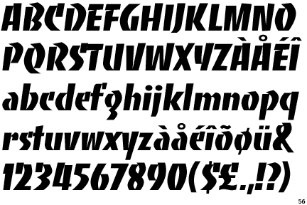
How did Choc, a quirky calligraphic typeface drawn by a French graphic designer in the 1950s, end up on storefronts everywhere? [NYT]
"Steven Heller, a co-chairman at the School of Visual Arts’ M.F.A. program, sees it somewhat differently. “You say ‘cacophony,’” he said. “I call it chaos.”
Huh? That seems less like seeing it somewhat differently than two different words for the same thing.
You say it tastes great, but I see it differently. I call it delicious.
posted by jonathanhughes at 8:28 PM on November 24, 2018 [21 favorites]
Huh? That seems less like seeing it somewhat differently than two different words for the same thing.
You say it tastes great, but I see it differently. I call it delicious.
posted by jonathanhughes at 8:28 PM on November 24, 2018 [21 favorites]
jonathanhughes: Not quite. Chaos implies simply disorder, randomness, anarchy. A cacophony implies a chaos, but it has other things on top of that, namely a lot of sounds screaming all at once, so that you can't pick out any one sound, or comprehend what you are hearing, each sound is overriding one another to the point you can't make any sense out of it.
posted by Canageek at 9:08 PM on November 24, 2018 [2 favorites]
posted by Canageek at 9:08 PM on November 24, 2018 [2 favorites]
I love this sort of thing.
posted by k8t at 9:20 PM on November 24, 2018 [2 favorites]
posted by k8t at 9:20 PM on November 24, 2018 [2 favorites]
Well, it beats the heck outta that faux-CJK typeface that used to be the thing for Asian restaurants, tell you what.
posted by Halloween Jack at 10:25 PM on November 24, 2018 [3 favorites]
posted by Halloween Jack at 10:25 PM on November 24, 2018 [3 favorites]
I'm interested in the extent to which this is a New York specific thing. The author certainly seems to make a good case that it is. My search for UK reference to "Choc Font" turned up stuff like this - different kind of choc. Meanwhile my search for French sources tend to be articles about Roger Excoffon rather than any illustrations of the font on signage.
posted by rongorongo at 10:29 PM on November 24, 2018 [1 favorite]
posted by rongorongo at 10:29 PM on November 24, 2018 [1 favorite]
tl;dr it's become a way for people to identify their restaurants as Asian, which then causes a virtuous cycle of people associating it with Asian restaurants. Film at 11.
posted by meaty shoe puppet at 11:03 PM on November 24, 2018 [7 favorites]
posted by meaty shoe puppet at 11:03 PM on November 24, 2018 [7 favorites]
I'm interested in the extent to which this is a New York specific thing.
The first sign is of a Teppanyaki restaurant. Here's one in Melbourne I drove past today. It's been there at least 15 years and it's signage is typical. I believe they do wash the New York signs with awfully characteristic water though.
posted by hawthorne at 11:11 PM on November 24, 2018 [2 favorites]
The real mystery is WHY IN 2018 IS THERE STILL SO MUCH COPPERPLATE OUT THERE
posted by escabeche at 5:52 AM on November 25, 2018 [6 favorites]
posted by escabeche at 5:52 AM on November 25, 2018 [6 favorites]
Do I recognize this font from the title credits of "China Beach"?
posted by MonkeyToes at 7:20 AM on November 25, 2018
posted by MonkeyToes at 7:20 AM on November 25, 2018
Dang, when a signpainter calls your font "graffiti" and says that he doesn't consider signage using it to even be signage at all, that's pretty harsh.
Yeah, a sign maker who spent 10 grand in 1984 dollars for a sign machine with only three fonts. I’d rather have Choc all over the place than that kind of uniformity.
It’s nice to see Excoffon get some love in the NYT. I’ve always loved his crazier work like Banco and especially Calypso.
posted by ejs at 7:41 AM on November 25, 2018 [4 favorites]
Well, it beats the heck outta that faux-CJK typeface that used to be the thing for Asian restaurants, tell you what.
Wonton font? If so, agreed.
posted by kurumi at 9:25 AM on November 25, 2018 [1 favorite]
Wonton font? If so, agreed.
posted by kurumi at 9:25 AM on November 25, 2018 [1 favorite]
Yeah, I don't know how I've never seen Calypso, after 20+ years as a designer, with the last nine years working as a professor! A colleague and I were talking about ubiquitous typefaces when we were first starting out and I mentioned Mistral... The NYTimes article makes the astute point that the "meaning" of a typeface often has to do with the accumulated uses (and abuses) of the face through time. I always associate Mistral with small town tanning salons... But this post has gotten me to look back over Excoffon's work - I love the small promotional Choc sample in the linked article! Interestingly, it reminded me of the faceted identity for the London 2012 Olympics (which I also liked, despite a largely negative reaction in the design community). Relatedly, in Googling, I also found Excoffon's work for the '68 Winter Olympics, which use a similar graphic texture technique as Calypso. I feel like, in some alternate dimension out there, Excoffon did identity or set design work for Pee Wee's Playhouse (which is a compliment). Thanks for the post!
posted by Slothrop at 9:43 AM on November 25, 2018 [2 favorites]
posted by Slothrop at 9:43 AM on November 25, 2018 [2 favorites]
Also, I came across this link while Googling which contains an interesting rumination on whether one should try to finish work begun by Excoffon.
posted by Slothrop at 9:45 AM on November 25, 2018 [1 favorite]
posted by Slothrop at 9:45 AM on November 25, 2018 [1 favorite]
Excoffon's Banco, Choc and Mistral used to be ubiquitous in France for small shops such as butcheries, bakeries, groceries, plumbers, hair salons etc. Mistral and Banco were probably the most common and remain widely used, though Choc signs can still be found.
posted by elgilito at 1:50 PM on November 25, 2018 [3 favorites]
posted by elgilito at 1:50 PM on November 25, 2018 [3 favorites]
« Older A small riot ensued | Tapers: picking up the sound at its moment of... Newer »
This thread has been archived and is closed to new comments
posted by Anticipation Of A New Lover's Arrival, The at 8:23 PM on November 24, 2018 [8 favorites]